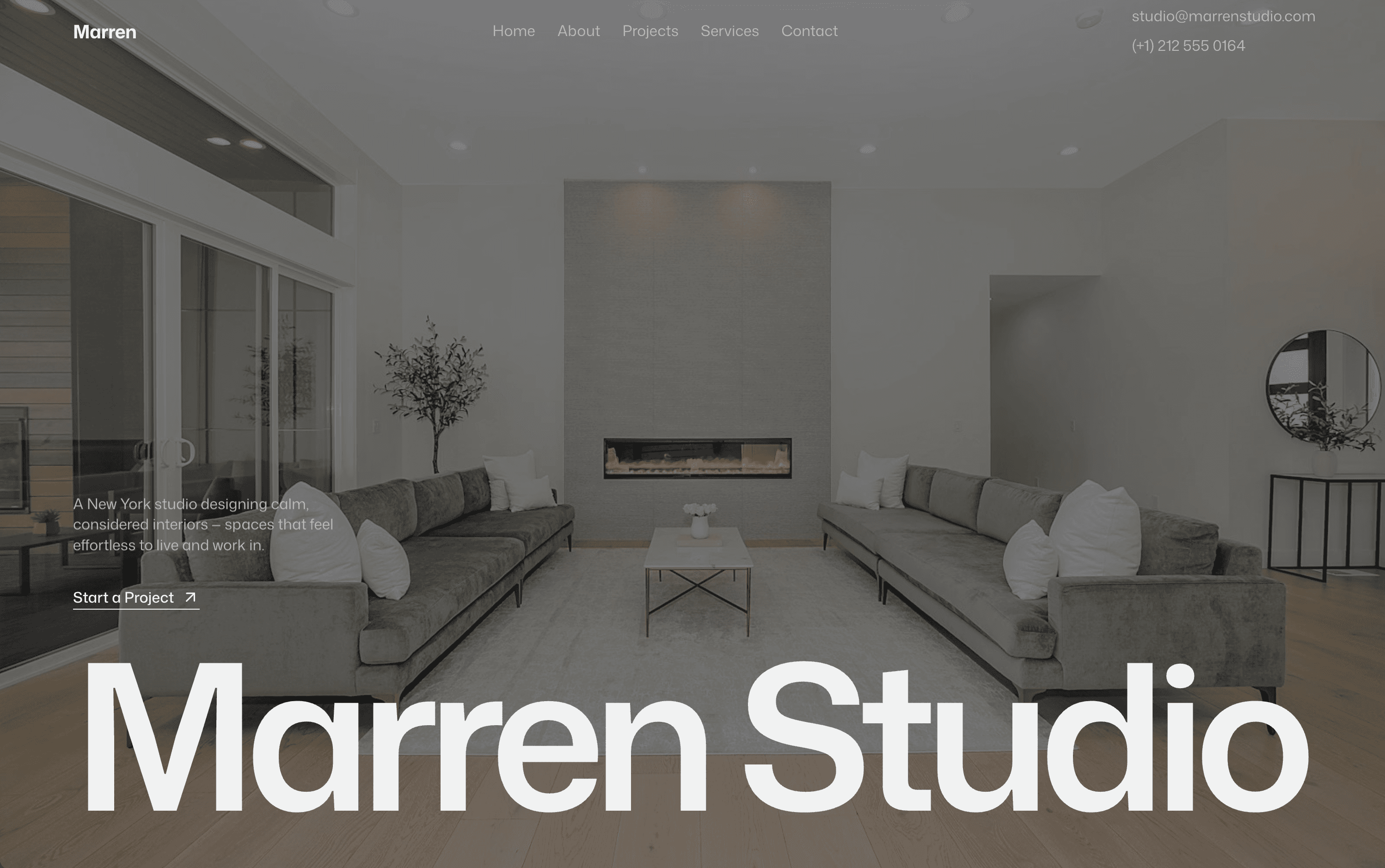
A full marketing site for a New York interior studio, structured to turn quiet browsers into booked consultations.
00
problem
Marren is a spec project I built to practice a longer, conversion-focused layout. The scenario: an established New York studio with real range, from lofts to offices, but a site that reads like a brochure. Lots of nice photos, no clear path to enquire. I wanted to keep the calm, high-end feel while giving the page an actual job to do.
solution
I designed and built a full site in Framer with a proper spine: a clear hero, animated stats that build trust, a selected-work grid, services and process laid out step by step, testimonials, and an FAQ that answers the questions people ask before they reach out. A single Start a Project action repeats down the page so the next step is always one click away.
The idea
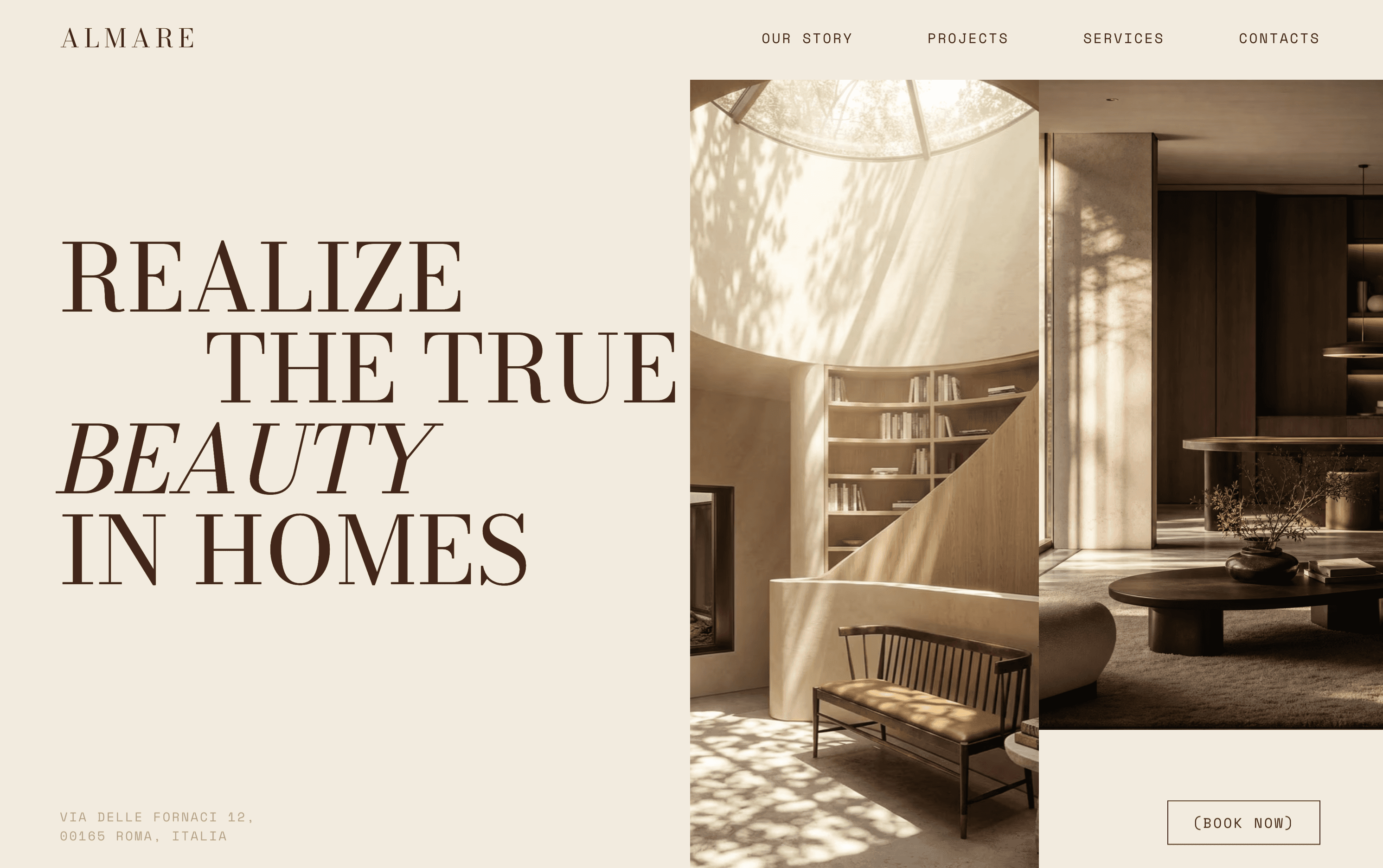
Where Almare was about restraint, Marren was about structure. I gave myself a bigger, busier brief on purpose: multiple services, a process, social proof, and still keep it feeling considered rather than salesy.
What I did
I mapped the page as a journey. The hero states what the studio does in one line, then the stats section (years, completed projects, satisfaction) earns some trust early. Selected work sits in a clean grid, services and process are broken into numbered steps so the offer is easy to scan, and the FAQ removes the small doubts that stop people booking.
The build
Designed and built in Framer with count-up numbers on the stats, an accordion FAQ, and gentle reveals as you scroll. It is fully responsive and every section points back to the same clear action.
What I took from it
This one was practice for the part that actually matters to a business: guiding a visitor from first look to first message. It is a made-up studio, but the structure is exactly what I would build for a real one.
year
2024
timeframe
2 weeks
tools
Framer
category
Web Design
see also