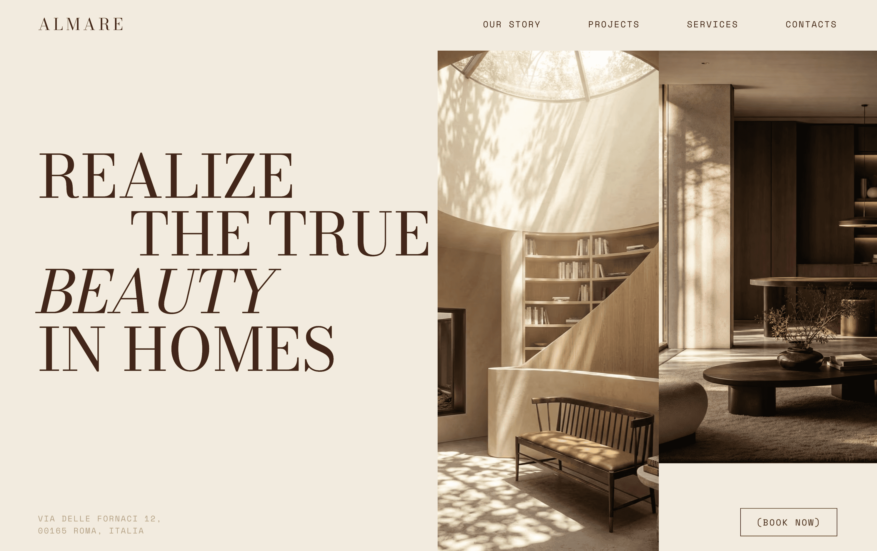
A one-page site for a Rome interior studio, built to make the work feel as calm and considered as the rooms themselves.
00
problem
Almare is a made-up studio I used to push myself on editorial layout. The brief I set was simple and hard: an interior practice known for light, plaster, and restraint needs a site that shows almost nothing and still feels rich. Most templates would drown that with big sliders and loud sections. The challenge was to hold attention with type, space, and a handful of photographs.
solution
I designed and built a single scrolling page in Framer. Oversized display type carries the story, projects sit in a quiet grid, and the whole thing moves at a slow, deliberate pace. Generous white space does the heavy lifting so the images breathe. Every section earns its place, and the one clear call to action is to book a consultation.
The idea
I wanted a project that would force me to design with less. Almare gave me that. The imaginary studio works in plaster, wood, and linen, so the site had to feel like the same material palette: warm, tactile, and unhurried.
What I did
I set the type first and built everything else around it. A large serif does most of the talking, with small mono labels for structure. The layout is a long single page so the story reads top to bottom, the way you would walk through a home. Projects are shown as a short, curated record rather than a full archive, because the point was to suggest depth, not list everything.
The build
Designed and built end to end in Framer, with soft scroll reveals that keep the pace slow and calm. It is fully responsive, and the whole page stays fast because it leans on type and space instead of heavy media.
What I took from it
This one taught me how much you can say by removing things. It is a practice piece, not a real client, but the restraint carried straight into how I approach real interior studios now.
year
2025
timeframe
2 weeks
tools
Framer
category
Web Design
01

02
03

see also